Crunch Fitness App
A gym member app that feels like an upsell tool
This is a concept project that I made out of frustration as a user of the member-only app of Crunch Fitness (an international gym chain).
This app has features like scheduling a class, requesting a trainer, logging workouts, etc., all buried underneath upselling cards, hindering the usability and actual usefulness of the app.
I redesigned the app around a simple rule: The actions members repeat most should be the easiest to reach.
RESEARCH + AUDIT
The core features were there but the hierarchy made them hard to reach
I started with my own repeated use of the app, then checked those observations against the physical gym experience and public member reviews.
Without product analytics or a recruited member sample, I treated the patterns I found as hypotheses to investigate.
01 / FREQUENCY
The most important button was one of the smallest
Members use their QR to enter the gym, check in for classes, and make purchases. But in the app, it is treated like a secondary action.
02 / MOTIVATION
Promotional content competed with core tasks
Offers and referral cards appeared before classes, gym capacity and other member tools. Upselling, while natural for businesses, should not compete by hindering a paid service.
03 / CORE BEHAVIOR
Workout logging felt like an extra.
A basic fitness task took more effort to reach than an offer.
04 / TECHNICAL CONSTRAINT
Some native-looking screens were actually web pages.
My Account, Check-In History and Class Schedule open Crunch web pages inside the app. That suggests a shared or legacy web layer. I treated those flows as a technical constraint instead of assuming every screen could be rebuilt natively.
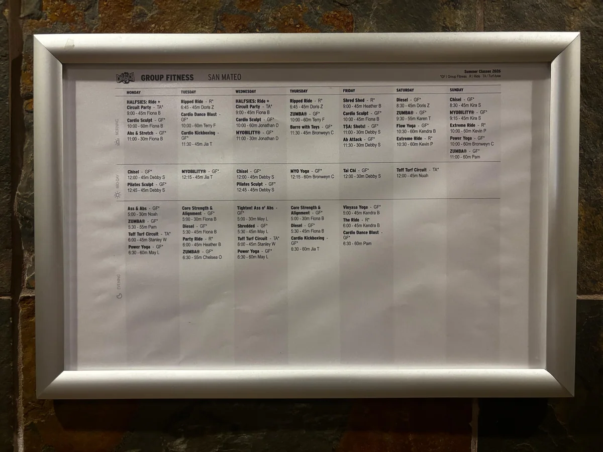
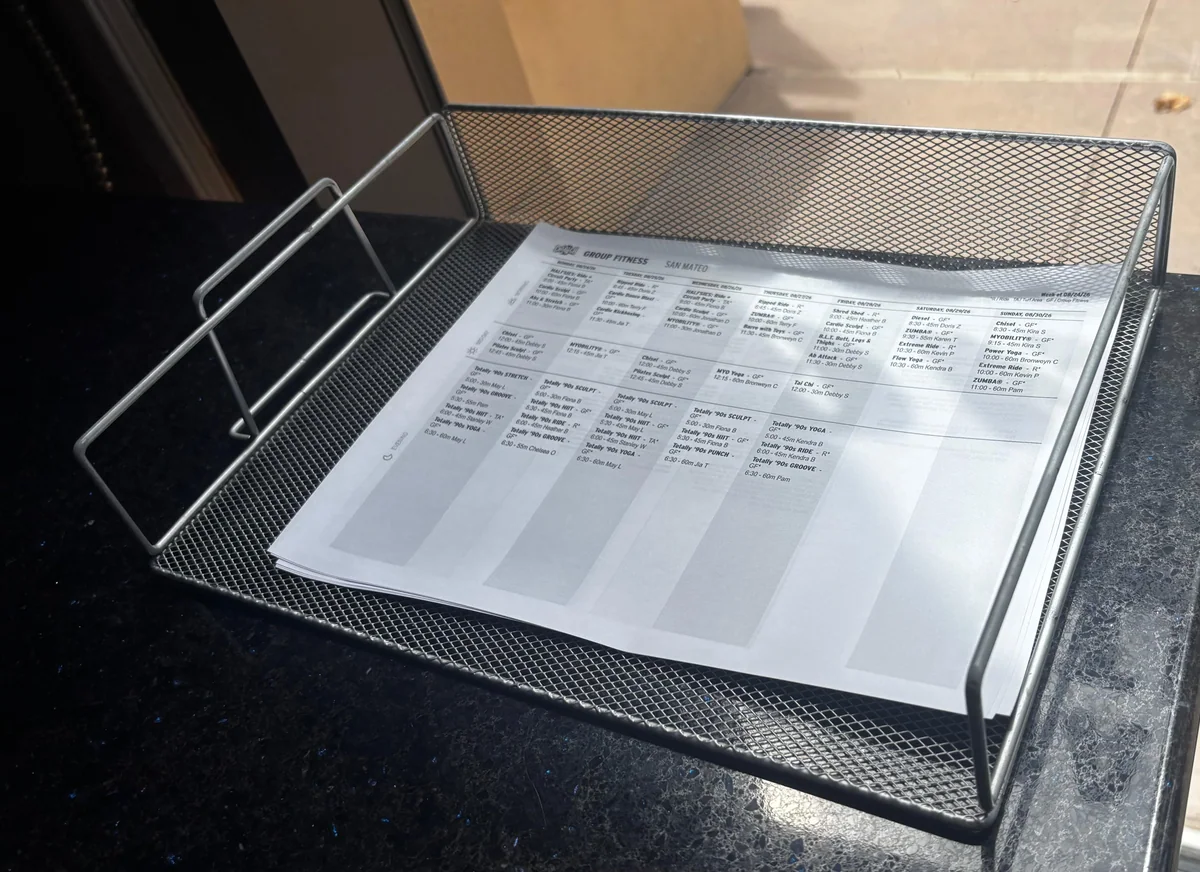
In 2026, a gym with a member app still relies on a printed wall schedule and paper handouts to communicate group fitness classes.
USER VOICE
Of course, my own experience was only the starting point
I use the Crunch app several times a week, so starting with my own experience helped me notice problems in context. But being close to the product also made it easy to assume other members used it the same way I did.
Looking through member reviews helped me challenge that. Some people shared the same frustrations, while others were perfectly happy with flows I wanted to change. That was a good reminder that reviews can point to patterns, but they cannot replace watching real people use the product.
“Why can I not view my check in history right on the front page? Why is tracking workouts so difficult now?”
APPSRANKINGS.COM / N.D.
“new update focuses on products not people”
JUSTUSEAPP.COM / 2022
“Classes missing & not user friendly for Adding Workout”
APPSRANKINGS.COM / N.D.
CONSTRAINTS
What I could not know from the outside.
I had no product analytics, internal roadmap, codebase access, or recruited Crunch member sample during the redesign. That limited what I could claim and made the interface itself my main source of evidence for this project.
Therefore, my approach was to logically determine the priorities for this redesign based on observable data I had available.
PRIORITIZATION
The app should be a tool for what members need most.
So... what do they need?
Before moving screens around, I ranked the main actions by how often members use them and how crucial the action is for the app’s core features.
*This was a design tool, not a research result. It gave me a clear reason for moving each feature up or down.
HIERARCHY
The one feature you need every visit wasn’t in the nav bar
The check-in code lived as a small icon on the top right corner. Every destination in the tab bar was used less often than that, and one slot went to a weekly read. I merged Progress into Training and spent the freed center slot on check in.

CHECK IN
HEADER CORNER → CENTER ACTION
The only thing every member does on every visit, parked in the hardest corner to reach. It is now the raised center control, opens as an overlay sheet, and is reachable at all times inside the app.
PROGRESS
TAB 3 → SEGMENT INSIDE TRAINING
A weekly read was holding the central slot on the nav bar. Workouts and Progress are the same loop, so I moved them to a toggle section on a single tab.
Deals and Profile kept their slots. Although I tweaked them for easier usability.
REDESIGN
Key redesign screens
01 / MAKE CHECK IN EASY TO REACH
Put check in at the center of the navigation.
Members use check in on every visit, so I gave it the most reachable position. The other tabs sit around it. The QR code is one tap away from any main screen.
The center action uses valuable space. I used it for the task members repeat most.
02 / MOVE OFFERS OUT OF THE WAY
Make navigation match what members come to do.
The main navigation now follows member tasks. Deals still have their own section, but they no longer sit in the path to core features.
Offers lose space on the home screen. They still have a clear place in the app.
03 / BRING PROGRESS INTO VIEW
Make progress easy to see.
Progress now has a clear place in the product. Members can see how they are doing without digging through promotional content.
Not everyone cares about rankings. That part stays optional.
04 / MAKE LOGGING EASY TO REPEAT
Show recent workouts when members log a session.
Logging gets a clear entry point and visible history. Members can use the last workout as a reference instead of rebuilding it from memory.
New members will not have history yet. The empty state should help them start their first log.
INTERFACE COMPARISON
What got easier?
I compared the original app and the redesign using four things I could measure from the screens alone. I looked at actions, first-view content, scrolling and target size.
LOG WORKOUT
2 → 1One less step to log a workout
The original needs a scroll and a tap. The redesign needs one tap.
HOME FIRST VIEW
2 → 0Commercial interruptions
The original Home shows News and Refer a Friend before Classes. The redesign puts Classes in the first content group.
GYM CAPACITY
1+ → 0Required scrolls
In the original, Gym Capacity sits below the first screen. In the redesign it is visible as soon as Home opens.
QR ACCESS
≈93% largerA bigger, easier target
Relative to screen size, the QR button is about 93% larger and moves to the bottom center. That should make it easier to reach with one hand.
DESIGN INTENT
The redesign reduces navigation effort while keeping Deals visible as a business surface. Whether members actually move faster still needs usability testing.
WHAT I WOULD TEST NEXT
I would recruit members with different routines and compare the original and redesign on four tasks. Check in, log a workout, find recent progress, and book a class. I would record task completion, wrong first taps, hesitation, and recovery from mistakes.
TOOLS & WORKFLOW
My design judgment, supported by AI.
For this Crunch redesign, I own the priorities, interaction logic, and visual design. AI helps me move faster, but the decisions stay mine. I keep adding tools as each new project calls for them.
Research & scope
ChatGPT and Claude help me map the fitness-app landscape and frame the scope. I set the priorities from the app audit, member reviews, and my own use of Crunch.
Sketches & wireframes
I sketch by hand, then explore layouts in Figma with help from ChatGPT and Claude. I decide the navigation, task hierarchy, and visual direction.
Interaction & prototyping
I define how the product behaves, and AI helps me prototype and compare alternatives faster. I review every option and refine the details myself.
From Figma to code
I prepare designs with ChatGPT, Claude, or Claude Code, then build them in Codex or Cursor. I debug by hand in VS Code.
REFLECTION
What I learned from redesigning a product I already use.
A feature existing isn’t the same as it working.
Crunch already had everything I needed in there somewhere. Nothing was ranked. Before I touched type or color, I had to decide what a member opens this app to do, then let everything else fall behind that.
Maintaining functionality and upselling must be carefully balanced
Promotions do not have to disappear. But they should not block the tasks members came to do.
How I kept my assumptions in check
Using the app gave me useful context, but it also made overfitting easy. Public reviews helped me challenge my first perspective, including positive feedback that disagreed with me. The next step is direct testing with members who use the app differently.