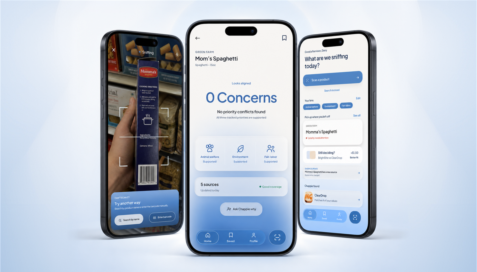
Many of us have been there: standing in the supermarket aisle, pulling out our phones to check if a can of coffee or a bottle of milk was made without harming anybody. For me, that meant opening endless chats on Claude or ChatGPT (depending on how much usage I had left), only to find confusing, old and even contradictory information from various sources.
As someone who just wants to keep a clear conscience regarding what’s in their fridge, I knew I was not alone in this, so I looked it up.
Research finds that Gen Z places greater importance on sustainable consumption than Millennials and is particularly motivated by ethical practices.
This is how the concept of Chappie was born (named after my beagle, a breed sadly used extensively in animal testing because of its gentle and trusting nature).
I designed it around a simple question: if the evidence is messy, how can the app be honest about that without making the decision for the shopper?
(Manley, Seock & Shin, 2023. University of Georgia).
PROBLEM SPACE
I started by finding what’s missing.




There are already existing ethical shopping tools that solve pieces of the problem, but they trade speed for depth, or simplify complex evidence into a single arbitrary score.
So I went out to ask conscious shoppers like me.
RESEARCH
Research, research... and more research
Because ethical shopping decisions are deeply personal, I combined a survey with in-depth interviews to understand how Gen Z shoppers evaluate uncertainty, evidence, and tradeoffs.
COMPETITIVE AUDIT
10 ethical shopping products
How do existing tools communicate scores, sources, and uncertainty?
SURVEY
25 responses
How much time do shoppers have, and what do they expect to see?
INTERVIEWS
4 values-driven shoppers
How do people experience ethical uncertainty while shopping?
decide in three minutes or less
want context, not a binary verdict
discovered a conflict after purchase
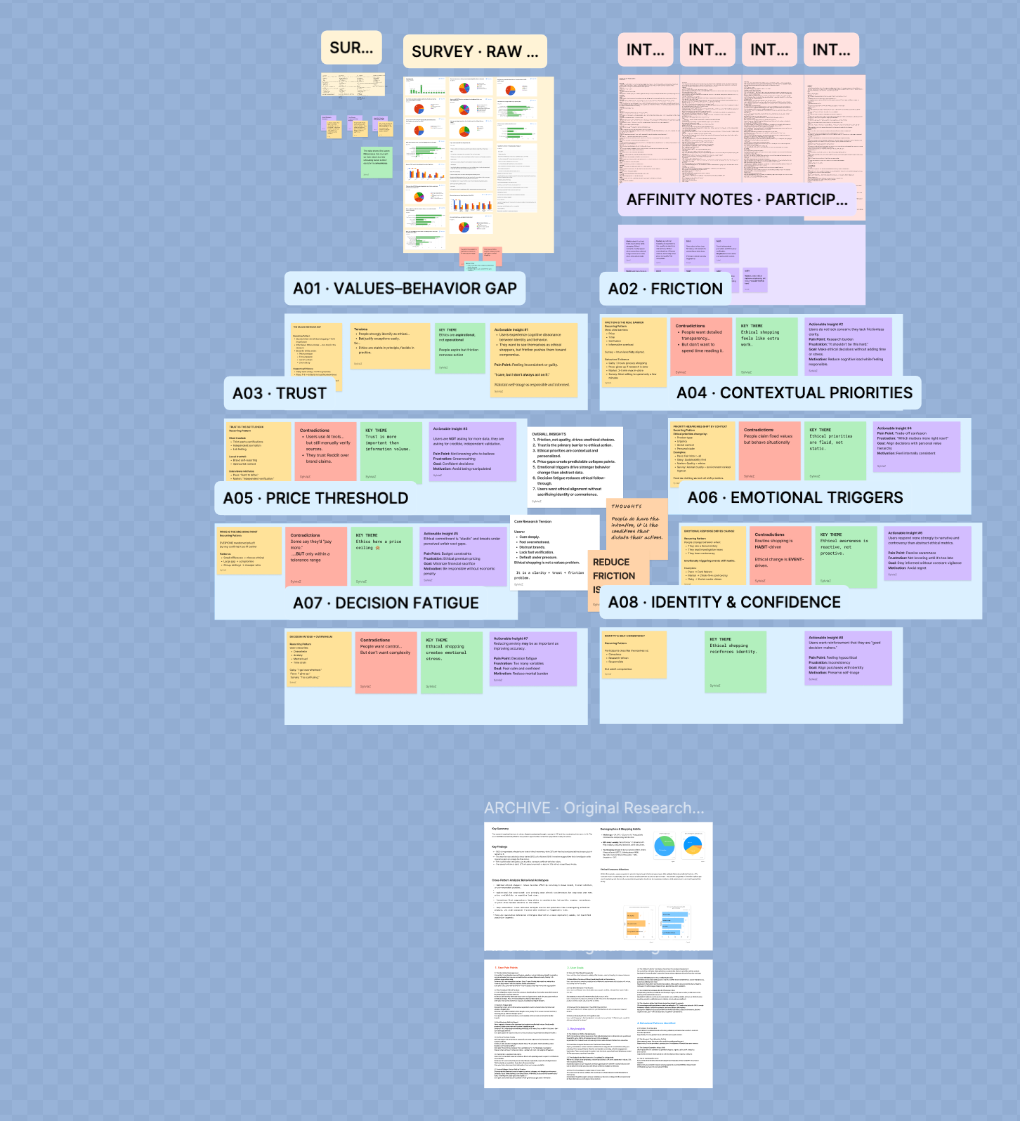
n = 25. This directional study informed the concept
and is not representative of the broader market.
FINDINGS
Across the audit, survey, and interviews, one requirement repeated: show the evidence.
DESIGN DECISIONS
Name of the game?
quick & anxiety-reducing
Overwhelming information makes shoppers just give up, causing uncertainty and future guilt.
The interface therefore must organize evidence, explain its reasoning, and leave the ethical judgment with the shopper, while keeping the interface visually clear and quick to judge at all times.
Core flow
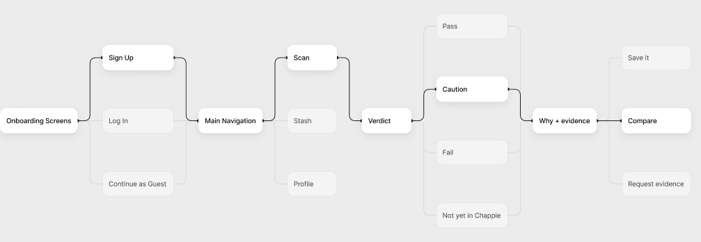
ENTRY POINT
Scan
Scanning gives shoppers the fastest path from a physical product to its ethical evidence.
DECISION 01
Verdict
Four states instead of a score, so the level of certainty stays visible.
DECISION 02
Why + evidence
Reasoning, named sources and publication dates sit on the same screen as the verdict.
DECISION 03
Act
One relevant next step per state. The app never makes the moral call.
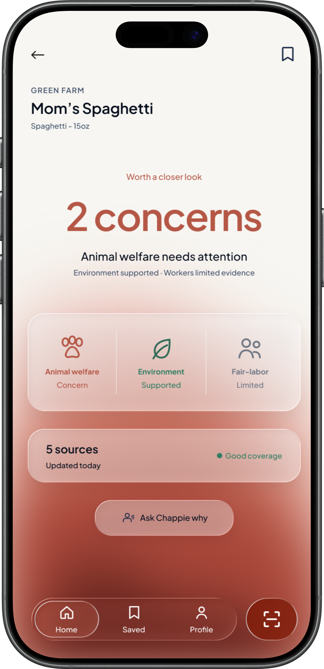
Four verdict states

PASS
Evidence supports it.

CAUTION
Evidence is mixed.

FAIL
Evidence contradicts it.

NOT YET
Evidence is missing.
01 / MAKE UNCERTAINTY VISIBLE
PROBLEM:
An arbitrary score can fake precision under complicated evidence
Most tools turn messy information into one number. That is easy to scan, but it can hide disagreement, missing data, or old sources.
*TRADEOFF:
Users lose some numerical detail, but gain a clearer sense of what the app actually knows.
02 / PUT THE PROOF NEXT TO THE VERDICT
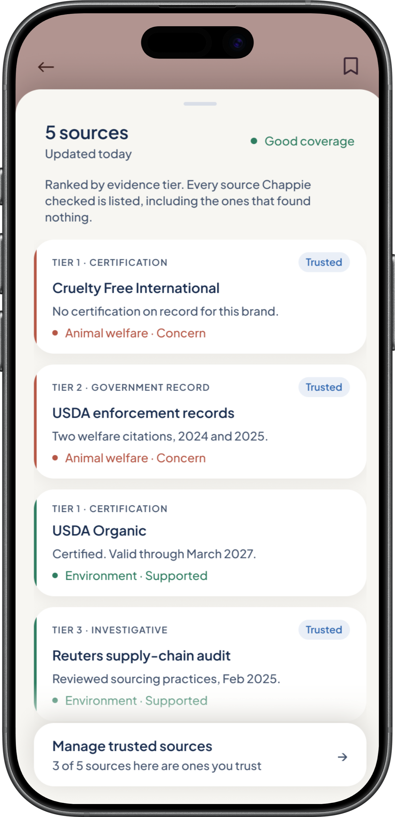
PROBLEM:
A result is hard to trust when the proof is somewhere else.
If sources are buried, undated, or separated from the verdict, users have to trust the app before they can inspect its reasoning.
*TRADEOFF:
The screen carries more information, so the hierarchy has to stay disciplined: verdict first, proof second, details on demand.
03 / HELP WITHOUT PREACHING
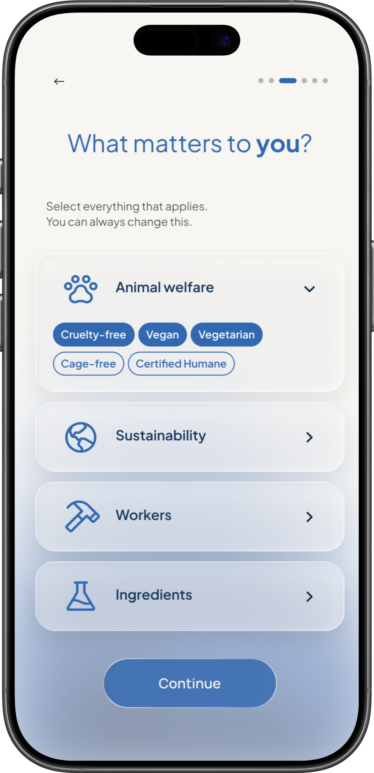
PROBLEM:
A shopping tool should not make people feel judged.
Interviewees described ethical shopping as overwhelming enough already. Telling them what they should buy would add pressure instead of clarity.
*TRADEOFF:
The app gives less prescriptive advice, but that is intentional. It supports a decision instead of replacing one.
TESTING
Testing, testing, testing
Once the prototype was working, I wanted to know if Chappie was doing what I designed it to do. Could shoppers understand the verdict quickly? Did the evidence make the result easier to trust? And most importantly, would the experience actually change the way they shop?
Average time to identify the verdict and explain what it meant.
Said Chappie would affect which brands they keep buying.
Said Chappie would change how they shop regularly.
n = 8
I tested the core experience with eight participants. The testing gave me confidence that Chappie’s core idea was working: ethical information did not need to feel overwhelming to be transparent.
TOOLS & WORKFLOW
My design judgment, supported by AI.
For Chappie, I own the product direction, interaction logic, and visual design. AI helps me move faster, but the decisions stay mine. I keep adding tools as each new project calls for them.
Research & scope
ChatGPT and Claude help me map the ethical-shopping market and frame the problem. I decide what matters, guided by the shopper research above.
Sketches & wireframes
I sketch by hand, then explore layouts in Figma with help from ChatGPT and Claude. I define the scan-to-verdict flow, how evidence appears, and the visual design.
Interaction & prototyping
I define how the product behaves, and AI helps me prototype and compare alternatives faster. I review every option and refine the details myself.
From Figma to code
I prepare designs with ChatGPT, Claude, or Claude Code, then build them in Codex or Cursor. I debug by hand in VS Code.
FUTURE EXPLORATION
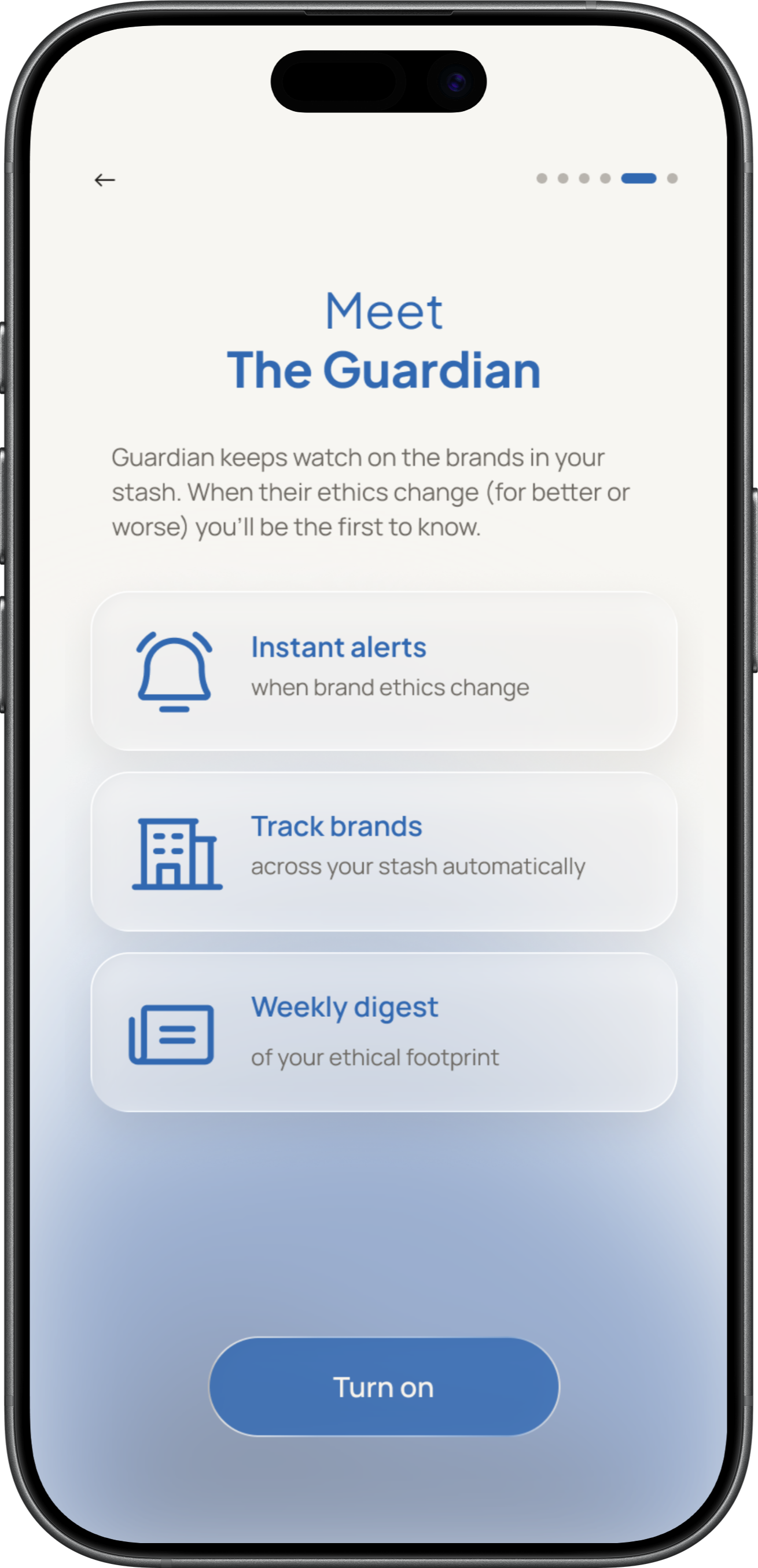
The Guardian:
a weekly, cited recap of your stash.
I explored a weekly evidence recap for saved products as an alternative to real-time ethical alerts, which risk raising anxiety without improving decision quality. I would validate the core scan experience before investing further in this retention feature.
REFLECTION
What this concept taught me about designing for trust.

Transparency is more than showing sources
A source list alone does not make an experience trustworthy. The interface also has to show what is known, what conflicts, and what is still missing.

Cutting features made the idea stronger
I removed rankings, price comparison, and app-generated judgments when they distracted from the in-store decision.